
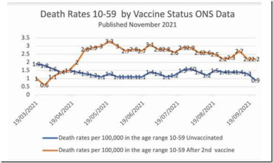
This chart may seem unbelievable or impossible, but it's correct, based on weekly data from the British government
The brown line represents weekly deaths from all causes of vaccinated people aged 10-59, per 100,000 people.
The blue line represents weekly deaths from all causes of unvaccinated people per 100,000 in the same age range.
READ AT THE LINK (GRAPH ALSO):