

"Have you seen any analysis of the NZ data posted by any prominent epidemiologist showing it is safe? I haven't and it's been almost 1 year since I set the data free.
The lack of transparency is stunning.
If you want to show whether the vaccine is safe or not, all you have to do is compare the time-series data from New Zealand to the time-series data from a safe vaccine published in a paper in the peer-reviewed literature.
Except for one small problem… no such paper exists because the health authorities refuse to release it.
Why would they do that if the vaccines are safe?" ...Steve Kirsch
A very long read however for those pressed for time, read the summary ...
Quick summary
This article goes into GREAT detail to explain the safety signals in the data leaked in New Zealand by Barry Young. It takes an hour to read. There are likely some typos…
So here’s the short story…
The NZ data, when analyzed using a gold-standard methodology used by the UK government, clearly shows that the vaccines are increasing all-cause mortality in those who were vaccinated. It’s no more complicated than this:
- when seasonal mortality is strongly declining, the mortality of the vaccinated is increasing.
- when seasonal mortality is strongly increasing, the mortality of the vaccinated is increasing even more.
In short, if you chose to get vaccinated, your mortality increased. The mortality increase happened every time you got a shot. It’s crystal clear.
I’ve looked at other time series data for other vaccines and you simply don’t see this effect so it isn’t an artifact of vaccination (the Healthy Vaccinee effect).
We see the same effect in other countries after a shot is given. Your risk of death increases. Every time. Every country. Every dose. Every season.
The world’s epidemiologists are silent.
None are calling for data transparency.
None have published any written work claiming the New Zealand data proves the vaccines are safe. Is that how science works nowadays? You ignore data you don’t like?
Before I disclosed the NZ data publicly, I offered it to the CDC because they have never seen patient record-level data for a vaccine ever before. They said they didn’t want to see the data.
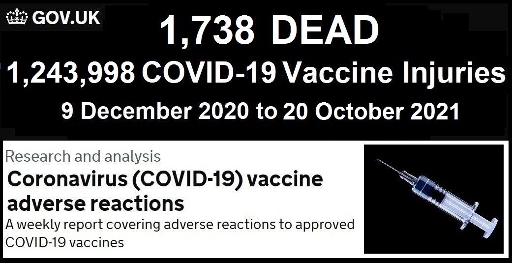
Even worse is that at a time when data transparency is key to eliminating misinformation, every one of the world’s health authorities refuses to disclose even the bare minimum, a time-series cohort summary report of their own data with weekly buckets and 5 year age categories, that would show the public whether the vaccines are safe or not. Members of Parliament asked the UK ONS for this and were turned down.
The lack of transparency is stunning.
If you want to show whether the vaccine is safe or not, all you have to do is compare the time-series data from New Zealand to the time-series data from a safe vaccine published in a paper in the peer-reviewed literature.
Except for one small problem… no such paper exists because the health authorities refuse to release it.
Why would they do that if the vaccines are safe?
No doctor in the world should be recommending these shots until there is the minimum requisite data transparency of the public health data. There is no excuse for this. The only reason you wouldn’t do this is if you knew you were killing people.
I also showed that even going further than just a time-series dataset and releasing the anonymized underlying patient record level data like I did with the New Zealand data, did not violate anyone’s privacy, yet allows for even deeper analysis than the time-series cohort summary records. That analysis shows the same safety signals as the time-series analysis.
Executive summary
The tragic “died suddenly” deaths will keep happening until health authorities worldwide release the record level data so that everyone can see whether or not there is a link between the COVID vaccines and excess deaths.
Critical thinkers might wonder, “Why aren’t any prominent epidemiologist calling for data transparency of public health data? Don’t they want to know?”
Apparently the answer is “no.” Not a single mainstream epidemiologist in the world is calling for transparency of public health data. As far as I know, it has never happened.
Transparency is easy. The UK ONS did it by exposing the time-series cohort analysis of their data. But they just choose very wide “buckets” that completely obscured the damage. Using smaller buckets, one week in length, would reveal the truth. When I asked Sarah Caul of the UK ONS why they didn’t do this, she didn’t respond even though I cc’ed a member of Parliament on my e-mail. That member of Parliament is now escalating the issue with the ONS. We’ll see how well that works out for the ONS.
We finally have record-level patient data thanks to the efforts of Barry Young, the courageous whistleblower in New Zealand. It’s been publicly available since Nov 30, 2023. Have you noticed that not a single prominent epidemiologist in the world has come out and proclaimed that the NZ data proves the COVID vaccine is safe?
However, people have gone into over-drive to unfairly discredit this data.
In this post, I will show you:
- That there is excess mortality in New Zealand and how you can determine that from the official death numbers.
- That the COVID vaccine,, and not COVID, is the most likely cause of these deaths.
- That a variety of different methods, including a time-series cohort analysis, can be used to show the massive safety signal in the records that Barry released.
If you are looking for a safety signal for a vaccine, it’s really hard to beat a properly done cohort time-series analysis. This is the same method used by the UK Office of National Statistics for analyzing the UK vaccine safety data.
I published all the data and analysis tools for allowing people to prove to themselves that the COVID vaccines are deadly.
However, to date, not a single person in the world has looked at the data and published a proper analysis of what the cohort time-series analysis of the data reveals. They all chose to ignore the time series cohort analysis and do their own, ad hoc analysis. Wow.
More importantly though is this: To date, not a single respected epidemiologist in the entire world has looked at the data and published in written form, anything about it. There is complete silence from the community after this unprecedented release of patient record-level data. They’ve never had any data like this in the history of the world and they completely ignore it!?! That’s the stunning news. It’s objective. No comments. Just silence. With just one exception I’m aware of…
I just learned of a claim from an epidemiologist in New Zealand, Janine Paynter, that there will be two analyses of the data (likely the other being from Helen Petousis-Harris). I hope they keep their word! But I seriously doubt it.
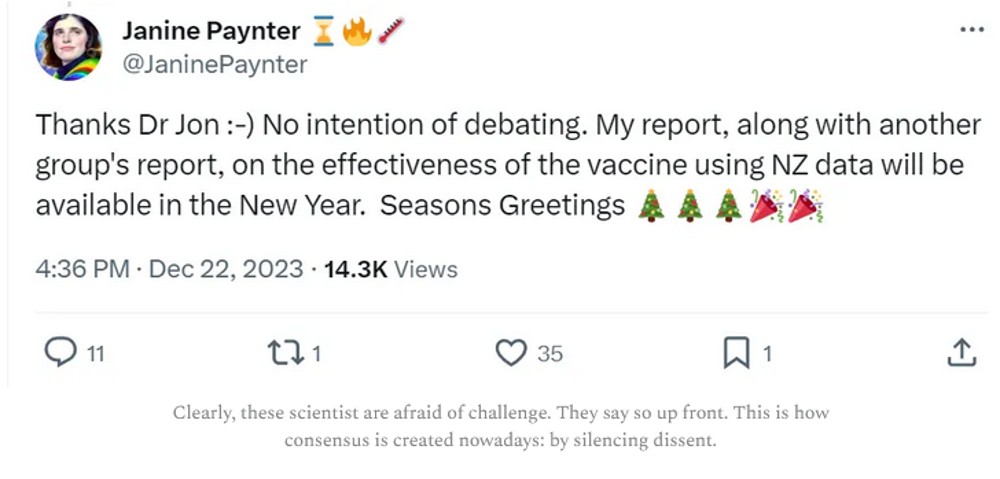
I predict that these epidemiologists will completely ignore the time-series data, cherry pick an analysis method that will obscure the signal, and then claim “there is nothing to see here” or that because “there is no control group” they can’t determine anything. They will provide no reason for avoiding the time-series methodology.
More likely scenario: They probably won’t even release their report. Ever.
In the time, in this article will show you how to interpret the time-series data.
The bottom line is that there is a very strong increase in the mortality rate of people who got the jab and it is a statistical certainty that this increase was not just random statistical noise. This means they should stop the shots immediately because it is a mathematical certainty that they are increasing all-cause mortality.
The only way the shots should be allowed is if there is at least 95% certainty that the vaccine improve all-cause mortality in the New Zealand. Mark my words: there is simply no chance of that. There is no possible way you can look at this data and come to that conclusion. Mortality rates always climb post-jab, even when seasonality would normally have them decrease
In other words, all the people pushing the shots are either bought off to look the other way or they are simply sheep following the herd and ignoring the record-level data that is now in full public view.
Thank you to Barry Young, the courageous New Zealand whistleblower for exposing the data that made these computations possible. No health authority in the entire world has ever made this information (patient record-level vaccine-death data) publicly available. They all keep it hidden from public view. That should tell you everything you need to know.
This is a dense article
If you aren’t interested in the details, stop reading whenever you want.
Provenance of the data
The tl;dr in this section is that I’ve done nothing illegal, immoral, or unethical. Health New Zealand (HNZ) has refused all requests to explain the data. They are deliberately looking the other way.
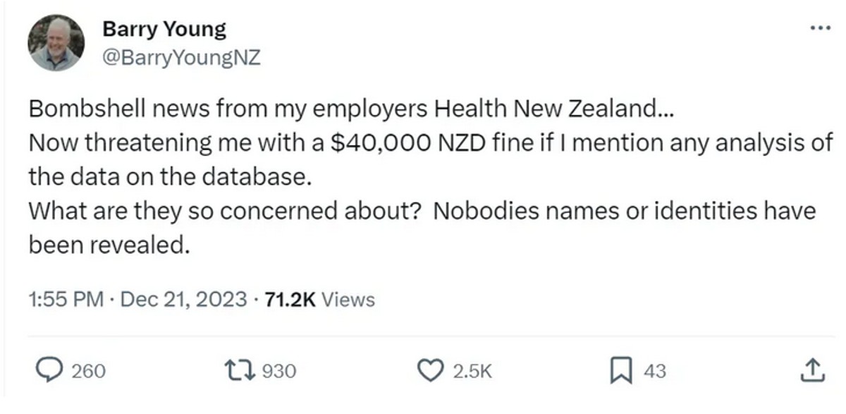
I received the data directly from Barry Young. I verified it’s authenticity by randomly selecting data and verifying that it matched the death records for that person. I asked Barry questions that only a DBA would know. Barry’s employer acknowledged that Barry was fired after sending all the top leadership of HNZ that their data showed people were being harmed.
HNZ sought to stop the leaked data from being published. If the data was fake, why would they have bothered to go to extensive lengths to do that. They also threatened certain people in New Zealand with a $40,000 fine if they talk about the data:
I’m a US journalist. Giving me the data is basically publishing the data. This is very similar to Daniel Ellsberg giving the New York Times, The Washington Post, and other newspapers the Pentagon Papers. While Ellsberg was charged with several crimes, all charges against Ellsberg were dismissed due to government misconduct. The newspapers were never charged with a crime. The Nixon administration sought to prevent the publication of the Pentagon Papers through legal means, arguing that it jeopardized national security. They obtained temporary restraining orders but failed to permanently block publication.
What I did in obfuscating the data and publishing my derivative work is not illegal, unethical, or immoral. I have not been charged with any crime nor I have violated any law according to any of the four attorneys I consulted with (just to be sure); two were US attorneys, one based in New Zealand, and one in the UK.
I have contacted HNZ and informed them that analysis of their data by myself and other respected individuals has shown very troubling safety signals that need to be explained. I asked them:
- For a copy of all the vaccine-death analysis that have been done at HNZ so I can see if we got it wrong
- If I could speak with one of their epidemiologists who is familiar with the data so they can explain how our analysis is flawed.
- To make the full data public, e.g., as a time-series data dump that would expose any safety issues but 100% protect patient privacy to eliminate any concern about what the data actually says. The data leak is slightly over 4M records, but the full dataset is over 12M records.
I do not want to spread misinformation. I seek only to engage in a dialog to those responsible for monitoring this information so they can explain to me how all of us who have looked at the data and found it troubling got it wrong
They expressed no interest whatsoever in opening a dialog on what the data itself says.
Everyone, especially in New Zealand, should find this lack of openness and transparency very troubling.
Equally troubling is that not a single epidemiologist in New Zealand is calling for data transparency of public health data. This can be done without jeopardizing patient privacy as I have demonstrated here. Not a single person can identify any of their records.
In short, the epidemiologists in New Zealand are all captured and will never demand that the public health data be made public. Why? Because they will be fired and they need to keep their jobs.
I am speculating that if it becomes known that the HNZ leadership promoted a vaccine which killed thousands of people in New Zealand, faith in the health authorities, government officials, mainstream media, and the medical community would be devastated. This could lead to jail time for the people who deliberately looked the other way and lawmakers who promoted the shots that won’t get re-elected.
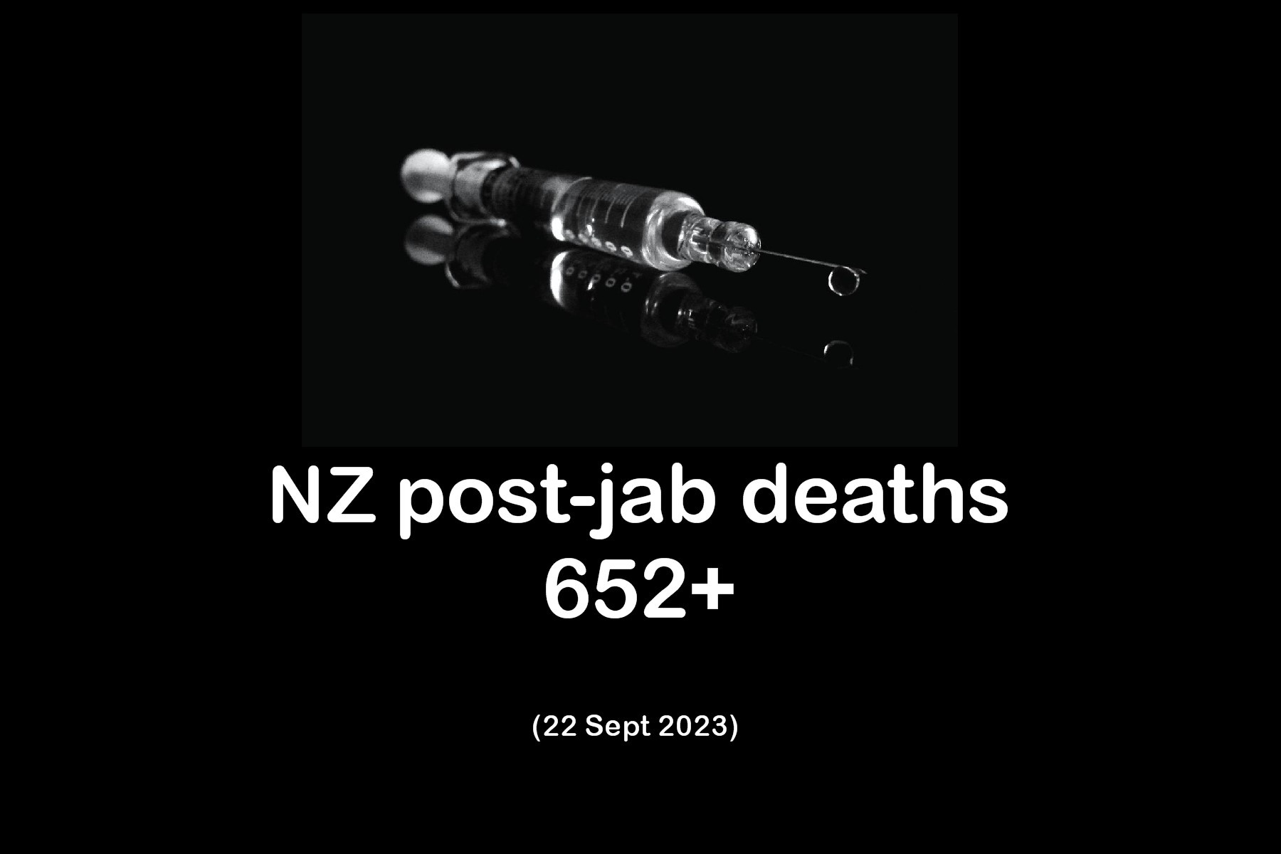
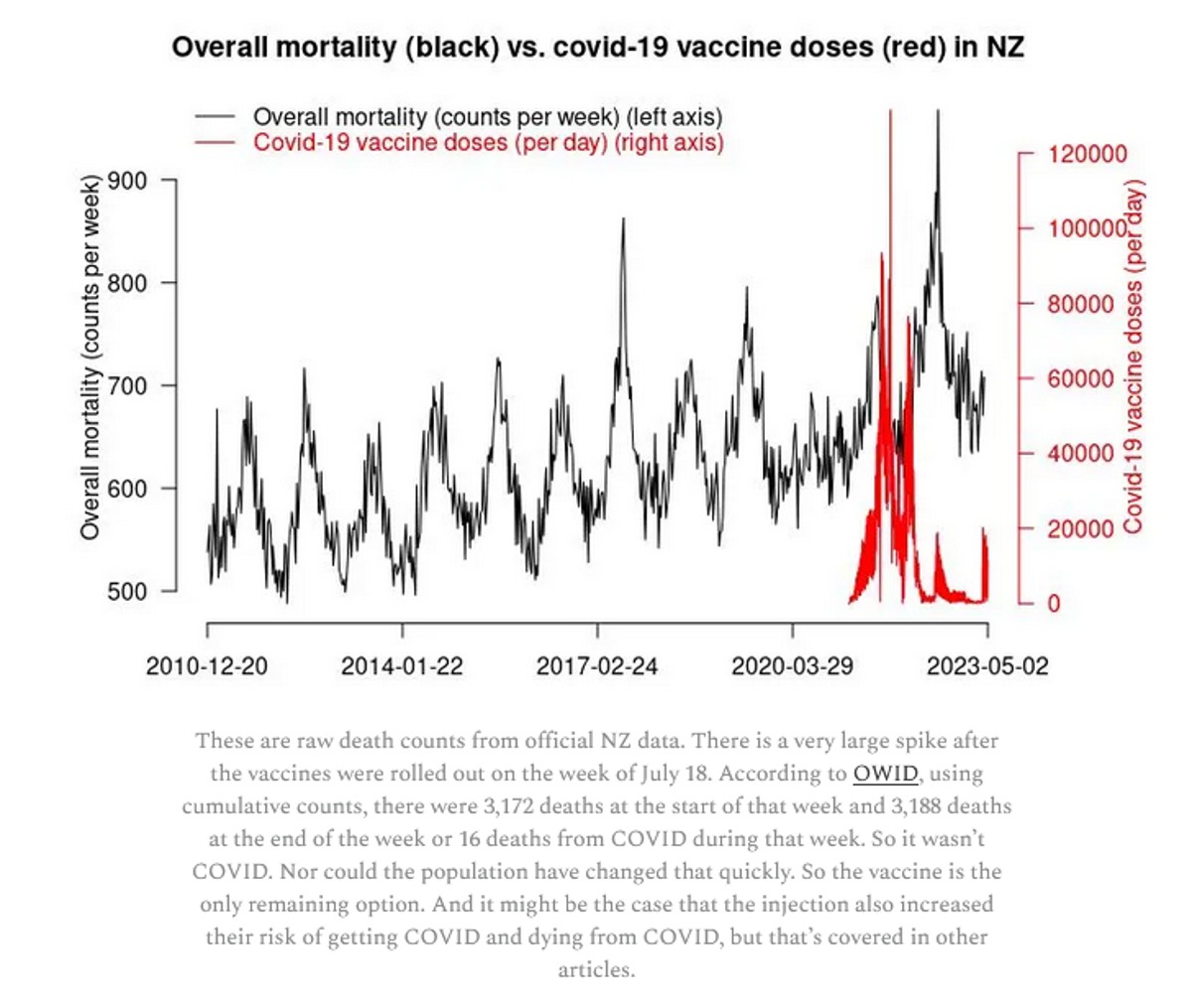
Official New Zealand data shows a huge increase in mortality starting right after the vaccine rollout!
The first thing is we have to show that the overall official mortality numbers in New Zealand show that we have a problem. Then we’ll show you that the data leaked by Barry Young is a smoking gun.
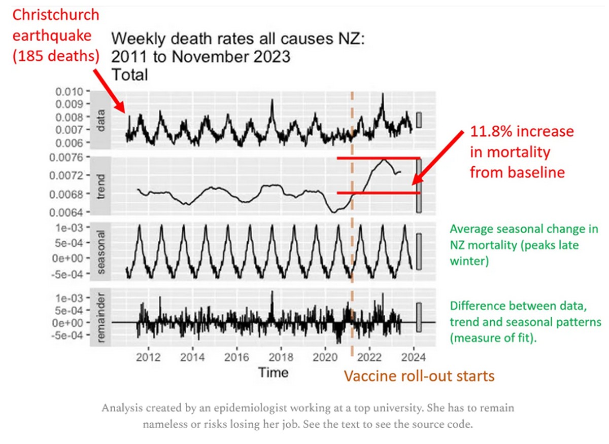
If the vaccine is safe, how to they explain this New Zealand chart? It clearly shows that deaths weren’t “returning to baseline” or “negative excess mortality” as is often claimed.
Whether Barry Young violated the law will be determined in a court of law, not in a court of public opinion. He has pleaded innocent to the charges brought against him.
The plot below was created by an epidemiologist at a top university who wishes to remain nameless so she can keep her job. It uses the latest weekly mortality rates in NZ from official data. She used the default values for the function to make the chart. She didn’t fine tune the parameters to get the results to fit her agenda. Can you believe that? You can download the R code and the spreadsheet of data from my Github and see for yourself.
Focus on the “trend” plot below. The trend shows increase of peak, compared to baseline of 0.0076/0.0068 = 11.8% increase. The mortality rise started abruptly at the start of Q4 2021 which was right after jab rollout. A coincidence? Unlikely in my opinion.
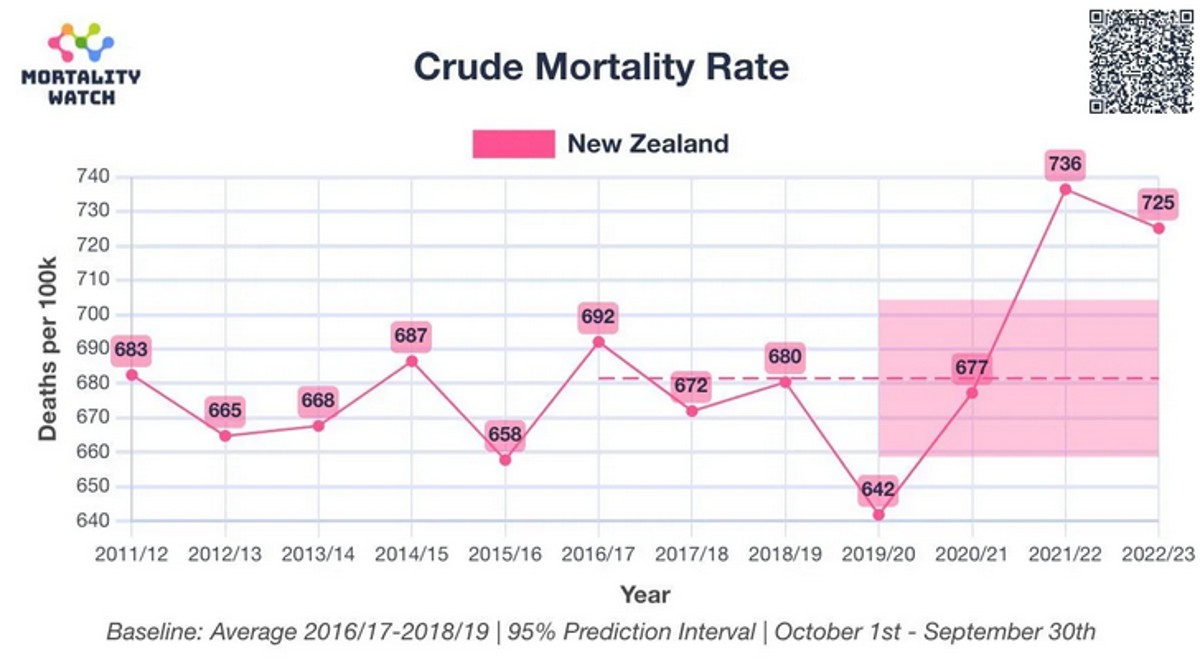
Here’s an independent assessment of the excess mortality. This looks like a problem to me. Thing go up starting right after Jan 2021 (which is normal).
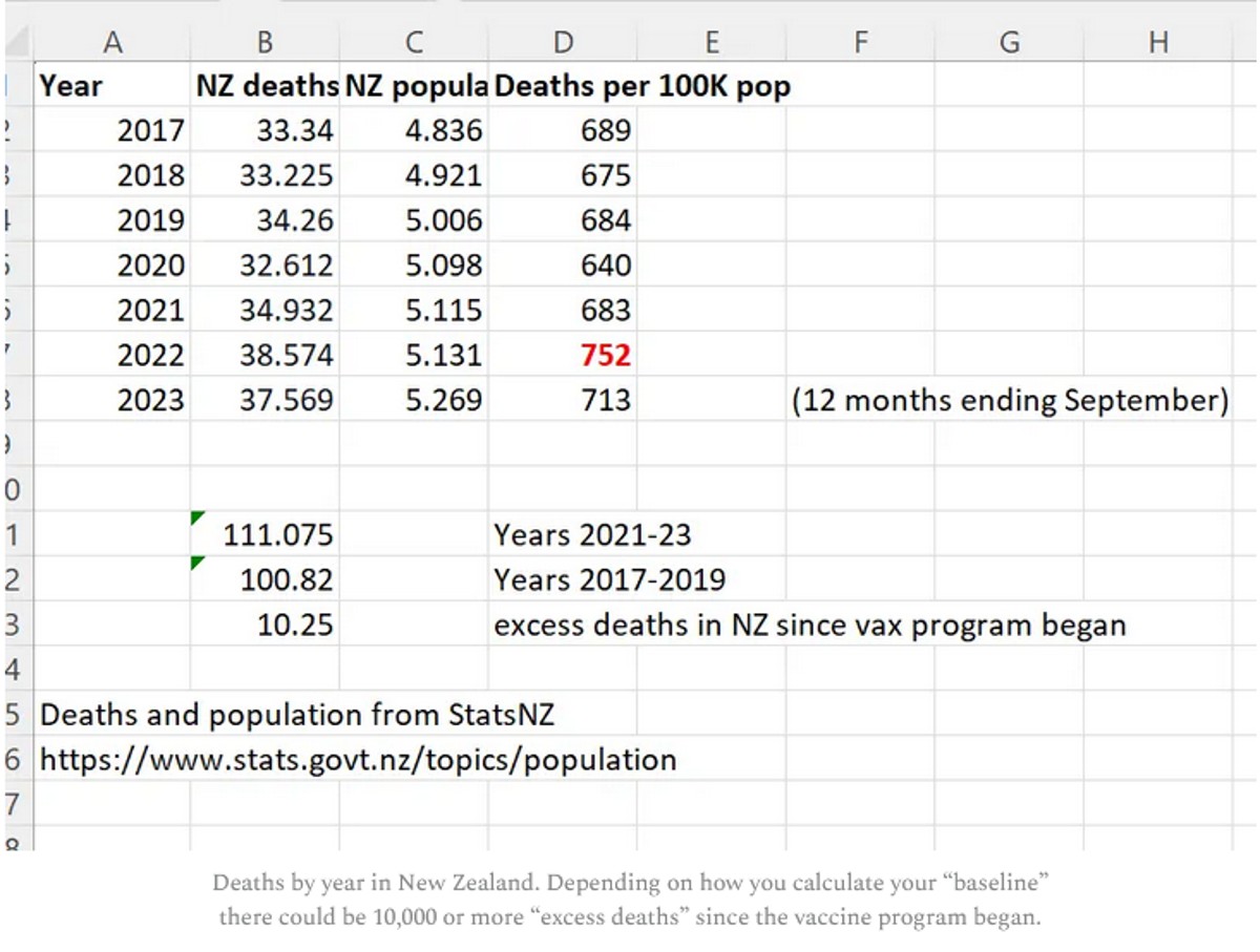
People were told deaths were up in New Zealand because the population grew. True. But they deliberately misled the public because the deaths per capita (which is what matters) increased. So even though the population increased, deaths increased even more. When they deliberately deceive the people like this and the press lets them get away with it, it is an indicator of a very high level of corruption:
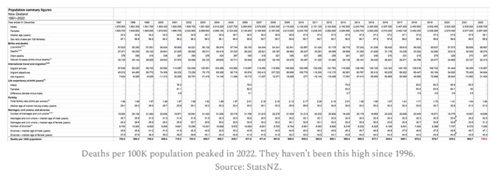
And finally, here’s the proof that the Deaths per 100K population was at a 12 year high in 2022 from the official New Zealand stats. See the number in the lower right in red.
An overview of the New Zealand data arguments
The cohort time series analysis is the definitive way to analyze vaccine death data like this. It’s what the professionals at the UK ONS use, for example.
Here are the key arguments from the time-series data in a nutshell:
- Not a single epidemiologist in the world has every called for a time series cohort analysis with weekly buckets such as the one I produced in just 2 hours using the New Zealand data. Nobody. Every in the history of the world. For any vaccine. In any country. Ever. What does that tell you? It tells you that the entire system is corrupt and bought off that there isn’t any transparency of public health data. This should make everyone furious. Every mainstream media outlet should be calling for this level of transparency so that the public learns the truth about vaccines. But they are all silent. There is absolutely no excuse for public health authorities not providing this.
- The time series cohort analysis method, used by the UK ONS, is the definitive way to analyze a real-world intervention like a vaccine if you want to know the truth. There is only one way to do it. Everyone gets the same output file. Here’s are the time series cohort analysis done by the UK ONS. They stopped doing them in August 2023, probably because the results were too incriminating. When I asked Sarah Caul at the UK ONS to publish the same data but with weekly buckets so we could see what was going on, I received no response.
- There is only one way to properly interpret a time-series analysis. If mortality climbs after every dose, regardless of seasonality, the vaccine should be stopped. Period. End of story.
- The definitive nature of the time series analysis is why epidemiologists avoid it; they are focused on pushing the narrative and keeping their job. They can’t have a clear way to interpret the data. They need something they can game that is not objective.
- There isn’t a way to interpret the HNZ time series data and conclude that the vaccines are safe. The safety signals are huge. For example, when mortality is declining for the population as a whole, if you were recently vaccinated, your mortality is going up when it should be going down. Nobody can explain how that is consistent with a safe vaccine.
- In order for the shots to be recommended, the time-series cohort analysis would have to show that we have 95% confidence that the vaccines reduced all-cause mortality. There is no possible way for any serious epidemiologist to claim this.
- Epidemiologists in New Zealand who support this analysis will lose their jobs if they speak out in favor of this data publicly. So they speak out privately.
- Dishonest epidemiologists will likely resort to the handwaving assertions that the vaccine is safe and HVE must be lasting for months. This is not supported by the data at all as I point out in the HVE section where I show that the deaths per week level off at week 3, meaning the HVE effect ends by 3 weeks.
- We restricted our focus in the analysis below to 60 years old and above, because that is where we have enough data to make a determination and that’s where the deaths from COVID are. It is a the target market for the vaccine. If it doesn’t work on this cohort, it’s over.
- The mortality rate for this cohort (60 and over) appears to be from around 1,600 to to 2,400. This accounts for seasonality swings which are around a 20% plus/minus from the centerline mortality rate of 2,000 deaths per 100K person years. So anytime you see mortality rates above 3,000 for people who opted for vaccination, we have a serious problem. If mortality rates stay within this range, the vaccine is safe. In our case, we see mortalities rates as high as 4,000 deaths per 100K person years.
- The time-series cohort analysis takes into account both number of deaths and number of people in each bucket, where each bucket represents people at a fixed number of weeks from the date of vaccination. It yields a mortality rate which we can then compare to the actual measured all-cause mortality in New Zealand at the time of the shots.
- What we find is that the mortality rate in every Dose where we have sufficient data (Doses 1 through 4) exceeds what is expected from background effects based on the actual reported all-cause mortality numbers in New Zealand which takes into account COVID, seasonality, etc.
But there is more to the New Zealand data than just the time series analysis. For example:
- If you have any fixed cohort of 80 year olds and older, the deaths per week must decline. It’s pretty close to a law of nature. But it doesn’t here. It’s a stunning violation of the way death works (it turns out that older people always die faster than their rate of death increases; this is true worldwide). Death counts increase over time. It’s something you rarely see.
- New Zealand sex data: Sex differences in mortality after the COVID vaccine depend on which dose you got. That’s impossible for a safe vaccine.
- New Zealand raw death count data: The raw death counts also rise each month when date of injection is restricted to a mortality peak (see the Raw Death Count Method below).
- The New Zealand lot number analysis shown below showing deaths per week increased after certain lots were given.
To show safety, you also need to be able explain the other evidence from other countries which is consistent with what the NZ data shows
The New Zealand time-series isn’t the only data point we have showing a serious problem. The data should also be interpreted in light of other evidence which includes, but is not limited to the following:
- The Medicare data puts the “HVE lasts for months” argument to rest. There you can clearly see the HVE slope vs. the vaccine slope. You can also see the HVE timescale in the pneumococcal vaccine. In both cases, HVE, which has a high upward slope, is gone after 21 days. It shows the COVID vaccine is killing people.
- There are also “impossible anecdotes” (such as Jay Bonnar) that can be 100% verified and there no counter-anecdotes. Anecdotes like that of Jay Bonnar are only possible if the vaccine is killing around 1 per 1,000 doses.
- There are no “counter anecdotes,” i.e., people who lost 5 friends unexpectedly since the vaccine rolled out and all 5 friends were unvaccinated. These anecdotes should be easy to find it the vaccine wasn’t causing these unexpected deaths. I asked for anyone who knew 5 unvaccinated people who died unexpectedly and despite 100,000 views, there were no examples. However, I did get a lot of messages like this one which to any objective observer would be hard to explain.
- The US Medicare charts show what happened over time to Medicare patients given two vaccines in the same year. In one case, deaths decline every day. In the other vaccine, death climb every day by a rate that has never been seen before. How will they explain that?
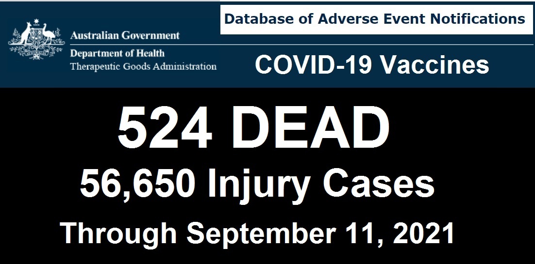
- The rise in mortality reported by the Israeli MoH mimics the rise in mortality in New Zealand and Medicare. Hard to explain away. Where is this happening with any other vaccine?
Terminology used
Record level data
Records are produced when people are born, die, and get vaccinated among other thing. Record-level data in this article refers to records contain the date and time of vaccination, what dose was given, and the birthdate and death date of the person. Generally, there is one record for every time a vaccination is given and those records have the date of birth (DOB) and date of death (DOD) as part of the record.
Death rate or DR
The death rate is the number of deaths per week or per month or per day. It is a measure of raw counts. This number can range all over the place and depends on what the age mix of the cohort you are following is and the number of people.
Mortality rate or MR
The mortality rate is a more normalized form of the death rate. It is expressed as deaths per 100K person-years. For example, the average mortality rate for 65-69 year olds in New Zealand is around 1,000 deaths per 100K person years. This means that 1% of this group would be expected to die in a year. So if you have 100 people in this age range at t=0, you’d expect to have 99 people alive after 1 year.
HVE
Healthy vaccinee effect refers to a 21 day period after a vaccination where mortality rates are artificially low because people who are very near death aren’t injected. But in New Zealand, this effect would be expected to be less than 21 days because every alive unvaccinated person was viewed as a threat to the living. See section below (“More on HVE”).
PPD
Pay Per Dose was the billing system the data is from. About 1/3 of all vaccinations were billed this way, slightly over 4M doses. There is no known systematic bias in who got a PPD shot.
HNZ
Health New Zealand aka Te Whatu Ora, the health agency which unwillingly provided the data to us, thanks to Barry Young. They have not published any epidemiological studies on their own data showing the vaccine is safe. Like most health agencies, they take a head in the sand approach to safety and trust the CDC.
Repository
Location of the data files from HNZ as well as derivative works to analyze the data. All this data has been anonymized so as not to reveal anyone’s personal information.
Time-series cohort analysis
A reliable method for analyzing interventions such as vaccines on a population. A database of patient records is analyzed by running through all the records multiple times (once per day). If a person is alive on that day, that person is tallied to exactly one alive “bucket”, e.g., the August, Dose 1, Week 2 , age 20-29 bucket. If the person died on that date, they are tallied to a death bucket and then no more tallies. Using this data, an appropriate visualization tool, and information about what is happening in the background (such as seasonal mortality, all-cause mortality measurements, mortality rates, COVID deaths, and more), skilled scientists can analyze the data very precisely.
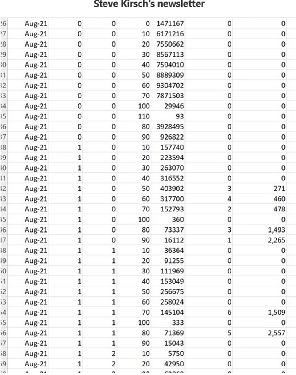
|
Here’s what the output of the time-series analysis looks like (this is only a small subset of the rows).
What the data is “supposed” to look like
There are 2 major ways look at the data if you want to see a signal (and an infinite number of ways to look at the data if you don’t want to see a signal).
Here is what a safe vaccine would look like in the ideal case where a vaccine is given evenly over time.
Note: If the vaccine is given over a short period such as in this case, the described curve below will simply modulate up and down depending on what is going on in the background (seasonality, COVID outbreaks, etc); the shorter the vax period, the larger the amplitude of the swings.
- Time series, no age bracketing: You’ll see a fixed upward slope of around 10% per annum because your fixed size cohort is aging. The slope depends on the age mix of the cohort. Under 30 is 5%; under 55 is 9%. 85 and older will be 15%. This is because your cohort is aging. So if you have a mixed cohort your slope will be between these values.
- Time series, fixed age bracket: You see a perfectly FLAT line. This is because your cohort has a fixed age distribution. Every week you’ll have people leaving as they get older, but you’ll also have a roughly equal number of people coming into the bucket because they got older. The bucket is always the same age range so it always dies at the same rate over time.
- DR plots. The deaths per month plots (which are a fixed cohort defined when someone is vaccinated) will have a slope that changes gradually over time. For a full sample snapshot of the NZ population, there will be a 4.2% slope in year one which reduces to 1.9% up in year 5. If you are looking at older cohorts, the slope will be lower and can easily go negative. In general, the slope of the deaths of a fixed cohort always goes more negative over time. For 70 to 90 year olds, the slope starts at 2.8% on year 1 and goes flat by year 4, and negative after that. There is a spreadsheet in the Generic analysis section of the repository (Age Standardized deaths) that allows you to calculate the expected slope for any age distribution. It also has the mortality rates for every 5 year age group as well as the annual increase in mortality.
The healthy vaccinee effect (HVE)
HVE is often provided as the “go to” excuse for rising mortality rates after a COVID dose is given. This is untrue as I’ll explain here. The HVE is always present for every vaccine, but it’s a constant. If anything, it is shorter for the COVID vaccine, not longer. But the data I have seen shows it is the same as always.
There are two different kinds of HVE: temporal and general.
The general type of HVE says that “healthier people opt for vaccination” so the baseline all-cause mortality of a vaccinated group can be lower than the population by as much as 65% for older age groups. This doesn’t mean the shots lowered their mortality. It means that relatively healthier people opted for the shots.
Sometimes these non-temporal HVE effects can be quite large (as high as a 65% reduction from baseline) in all age groups as was shown in this paper. For example, for age 85+, the unvaxxed mortality was 18.76 vs. 6.57 for those who opted for 2 doses. That is a huge 65% reduction from the underlying baseline mortality rate caused by selection bias.
This is why, when people look at the vaccinated in the New Zealand group, they will find that the mortality rate of the vaccinated is lower than the population as a whole. No surprise. It wasn’t the vaccine. It was selection bias.
The second type of HVE is known as temporal HVE. This is also a very real effect, but it only lasts around 3 weeks. HVE results in a significant depression of both death counts and mortality rates for weeks after a vaccine is given (generally 3 weeks). The and clause is very important.
HVE is caused by an exclusion bias where people who are going to die soon are excluded from the group who opts for vaccination. The deaths per day in the population don’t change of course, but you’ve pre-selected a cohort to get vaccinated who was less likely to die in the short run.
The primary causes of this selection bias are systemic which is why it remains constant for every vaccine and in every year:
- When you are hospitalized, in general, they don’t give you vaccines. This is because vaccines challenge your immune system and they want your immune system focused on what you were hospitalized for. People in hospitals are more likely to die than a matched group of people who are not in hospitals.
- When you are in hospice, the primary goal is to keep you comfortable as you pass away, not to extend your life. Half the people in hospice are dead by day 18. The others have a very long tail (and can be in hospice for 6 months or more). The people who are dead in 18 days are not vaccinated and removed from the vaccine rolls. The hospice stats are a key reason for the HVE largely disappearing after 18 days.
Temporal HVE is often abused by people who don’t understand this and used as the way to “explain way” the rise in the raw death counts when you look at death counts after a shot is given. A dishonest scientist will claim temporal HVE lasts for many months, rather than days. This is how they explain the rising mortality rate after the shots are given because they can’t blame it on the safe and effective vaccine, so it must be the mysterious HVE which they don’t understand.
Some have even speculated that HVE is small to non-existent for the COVID vaccines such as this person:
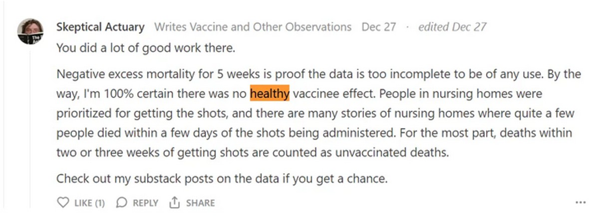
He’s 100% certain that there is no HVE effect.
But the data shows that there is such an effect and it’s super clear, the US Medicare data being the most convincing. So nothing is every 100% certain, no matter who you hear it from, including me.
The single most important part of temporal HVE is convincing yourself it only lasts around 21 days.
Here’s a magnified portion of the deaths after a COVID shot is given where you can verify the methods below yourself
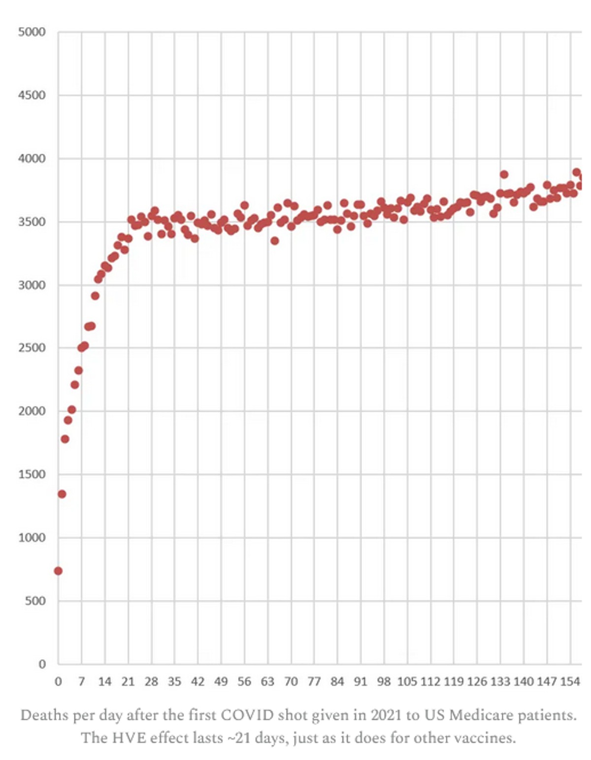
There are at least 7 different ways to estimate the time the HVE lasts, and they all give the same result when used on both safe and unsafe vaccines (~21 days).
READ AT THE LINK:
Comments powered by CComment