Print
uk-vax-death-rates

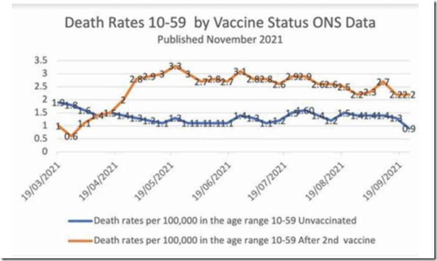
This chart may seem unbelievable or impossible, but it's correct, based on weekly data from the British government

By Alex Berenson

The brown line represents weekly deaths from all causes of vaccinated people aged 10-59, per 100,000 people.

The blue line represents weekly deaths from all causes of unvaccinated people per 100,000 in the same age range.

READ AT THE LINK (GRAPH ALSO):
https://alexberenson.substack.com/p/vaccinated-english-adults-under-60?r=7x92e&utm_campaign=post&utm_medium=web&utm_source=copy

Category: CV Injection Deaths Injuries
Hits: 1589

Comments (0)

Attach images by dragging & dropping or by selecting them.
The maximum file size for uploads is 10MB. Only gif,jpg,png files are allowed.
 
The maximum number of 3 allowed files to upload has been reached. If you want to upload more files you have to delete one of the existing uploaded files first.
Posting as

Comments powered by CComment